
All the Remote US Thermometer Readings
What story do these remote stations tell you?

The CO2 record
Everyone knows CO2 has been increasing. It isn’t very high historically, but it has been going up for more than 100 years, and some of that rise — somewhere between 20 and 80 percent — is due to humans …

My guess is that 30 to 70 percent of this is due to human activity. The rest follows Henry’s law and comes out of the oceans as they warm naturally since the Little Ice Age.
Berkeley Earth data
This is the normal story we hear about global temperatures:

This graph comes from Zeke Hausfather of Berkeley Earth. Zeke uses algorithms to “homogenize” the data to get this picture. In this case, homogenize means “make up temperatures to get the shape you want.”
Hausfather’s graph doesn’t represent global temperatures at all. As Willis Eschenbach explains in this post, Hausfather fudges most of his data. This graph does not represent the tropics, the southern hemisphere, the oceans, or Asia. It represents the US and Europe but is heavily tipped — with his thumb firmly on the scale — toward Canadian and arctic temperature readings. Jim Steele explains:
Unfortunately, we can’t trust government temperature reports.
If you’re interested in the process of adjusting temperatures, be sure to listen to Ross McKittrick explain what’s going on.
Roy Spencer has an excellent analysis of temperature data with the urbanization trends removed.
In today’s post, I thought I’d go to the raw data and see what I can learn.
Remote-station readings
I’m exploring the data from the Global Historical Climatology Network using Tony Heller’s tool at RealClimateTools.com. You can do this yourself easily. Here’s the instruction video.
First, I’ll explain why remote stations are important:
NOAA’s Global Historical Climatological Network has more than 1,000 thermometers with consistent readings since around 1900 to 1990, when they were replaced by satellite measurements. Today, about 25 percent of them continue recording. Many of them stopped in the early 1980s, when satellites began measuring temperature around the globe.
We can categorize these into two groups: those thermometers that were eventually affected by urbanization and those that are still remote. If you want to understand what nature is doing, these two groups need different treatment. For the first group, you need to try to figure out how the environment affected the thermometer. As we just saw, this can be tricky. It has to be done on a case-by-case basis, and it’s easy to get any shape you want, simply by choosing which stations to read and which to leave out.
There’s also a problem with “time of observation bias,” because some min-max thermometers were read in the mornings and others were read in the late afternoons. It wasn’t always consistent, and, according to Hausfather, the difference matters. But it matters less than you think, and it’s an excuse for clever programmers to get whatever they want as a result.
If you look at the remote thermometers, you see a different story.
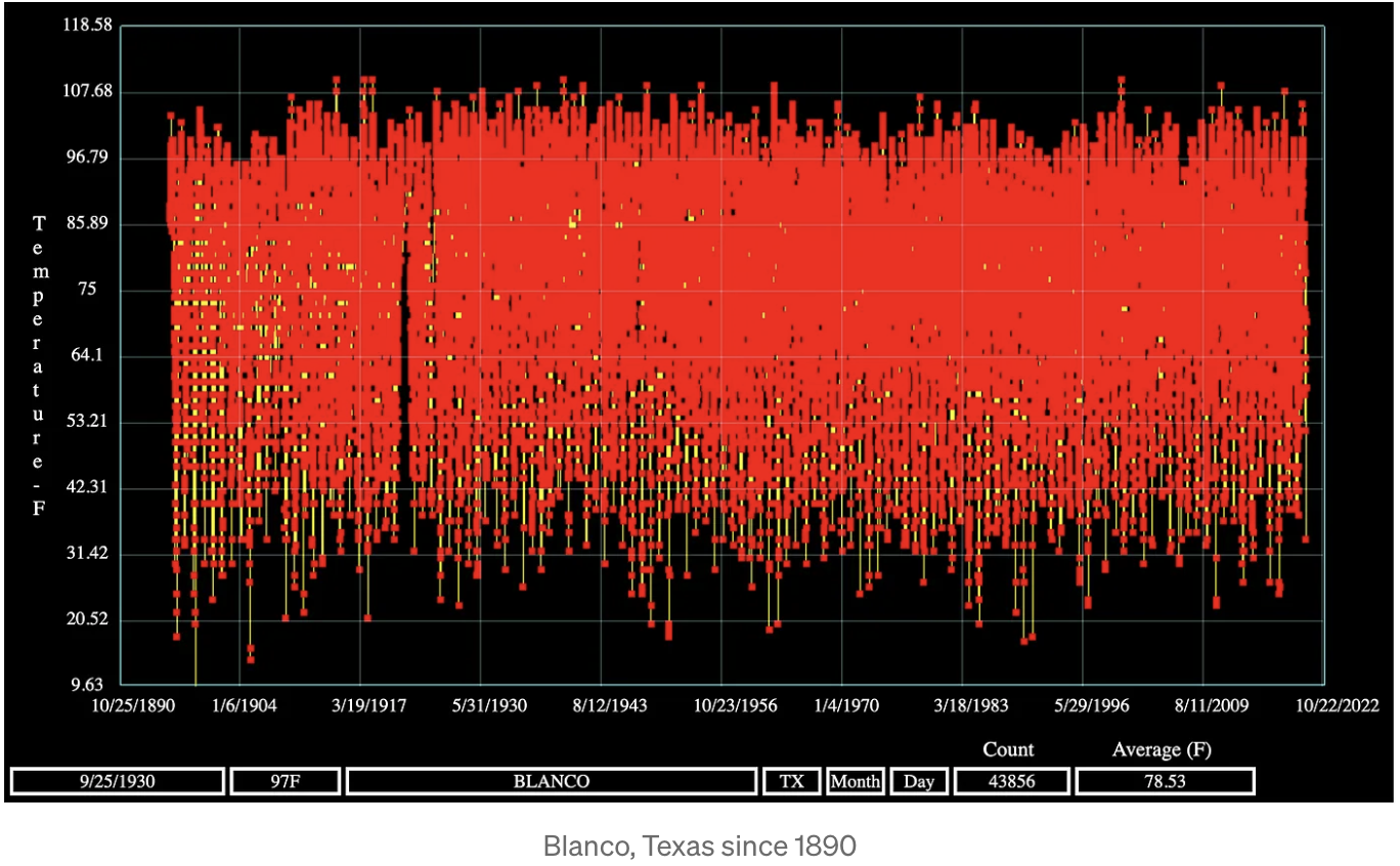
US remote station data
Below, we see the daily maximum temperature readings for each of several remote stations. Each dot represents a single day’s maximum — there are many overlapping dots — and the yellow lines don’t matter. The up-down oscillations represents summer max temps at the top and winter max temps at the bottom. Let’s start with Prescott, Arizona, which has been keeping records since 1898.

Prescott has seen explosive growth over the past 30 years, yet their weather station remains unaffected by urbanization. Note the hot 1930s that were hotter than today.
As we will see, all remote stations show this same basic pattern.
See if you can spot the trend in maximum temperatures driven by exponentially rising CO2:


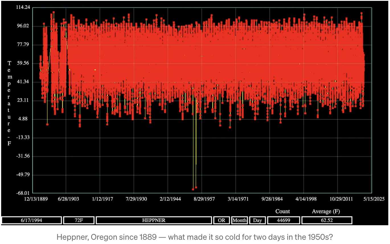
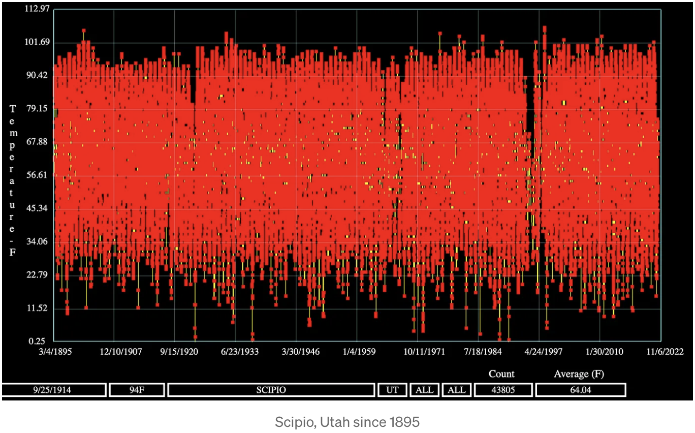

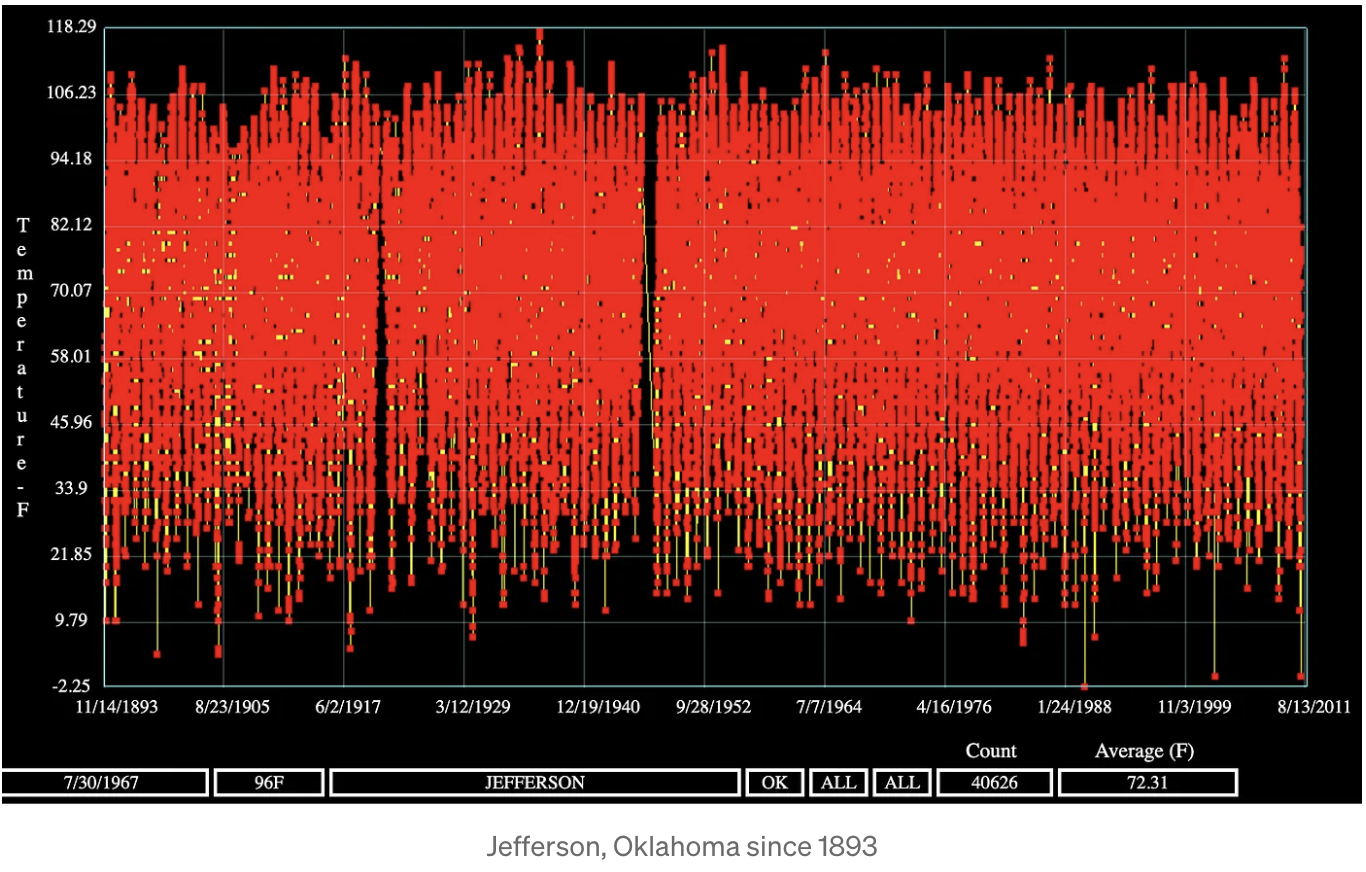
This is just a small sample. Here are all the stations in a single video. See if you can find the rising trend that is supposedly due to humans emitting more and more CO2 (turn sound OFF - trust me):
You can see these yourself. I’m not cherrypicking. I haven’t found a single remote station that shows any real correlation with CO2. You can see all the data for yourself at RealClimateTools.com. If you find a remote station that shows exponential warming to match CO2, let me know and I’ll add it here.