
European remote temperatures
Raw thermometer data does not confirm claims of global warming
This is a remarkable graph of daily high temperatures in Bologna Italy since 1845. Generations of people wrote down the temperature 56,243 times to bring you this data.

What do you notice?
Temperatures are increasing.
Again.
Look how warm the 1860s were in Italy. And the 1940s. They stopped reading around 2001 because by then satellites were doing a better job.
On another page, I have a record of the US remote-temperature record. Here, I want to cover Europe, using data from the Global Historical Climatological Network via RealClimateTools.com. These were screen-captured on January 6, 2024. All squares represent daily high temperatures. The colors mean nothing.
People say the earth’s temperature is rising, but that is just a sound bite. While 2023 was generally a hot year, it wasn’t hot everywhere, and one year is not climate.
Question 1: Are temperatures really going up?
Question 2: If so, what’s driving that? Is it CO2, or could it be something else?
Once again, for reference, here’s the graph of CO2:

Normally, the graph looks much steeper, but that’s because people cut off the Y axis at 300, which is a tricky way to make it look worse than it is. The UN and NASA routinely violate this basic rule of graphmaking: you must show the Y axis in its entirety.
Thermometer readings
As I mentioned last week, thermometer readings can be problematic, because thermometers that were far away from civilization many years ago have gradually been encroached by roads, parking lots, factories, cars, and the built environment. So you have to pick your thermometers.
I think it’s instructive to look at thermometer data from the Global Historical Climate Network but make sure to only look at data from thermometers that are still remote. If you include compromised thermometers, then you have to make adjustments, and that’s where the trouble starts.
For example, here are the daily high temperatures from Montelimar beginning in 1920, and they are still collecting measurements today:

Does this show a pattern to you? They’ve seen many scorching years, but not recently, and even 2023 was below average.
Here is daily high data from the remote station at Merignane since 1920:

This data doesn’t tell a story of temperatures going up as CO2 rose beginning in the 1960s. It’s very similar to the US remote data.
If you watch my videos, I show how the IPCC continually cherrypicks 1980 as its starting point for many graphs and neglects to show earlier data that they know exists. That’s why on this page, I’ll cherrypick only the remote, non-airport European stations that show data from around 1900. You’ll see there is some local variation, and each station tells its own story, but the overall story these thermometers tell is roughly the same all around Europe.
The high marks are summer highs; the low marks are winter highs. I’m using Fahrenheit just because that’s the default and less work for me.
In general, are the summer highs changing? Is there a trend? It’s hard to tell the last 20 years from several other 20-year periods.
Are the winter highs changing? Do they show a trend? In general, we do see winter highs rising over the last 30 years. This shows that winters have become a bit milder as a result of arctic amplification, which has happened thousands of times over millions of years — it’s part of a normal pattern. Arctic amplification is addressed in Javier Vinos’s book, in the chapter on “Modern Global Warming.”
All these remote-station datasets include 2023 on the far right. Being an el-Nino year, 2023 was quite warm in general. But in these graphs, you don’t see much for 2023, because most of the maps you see of 2023 being “off the charts” are cherrypicked temperatures from urban and airport thermometers. See for yourself …
France


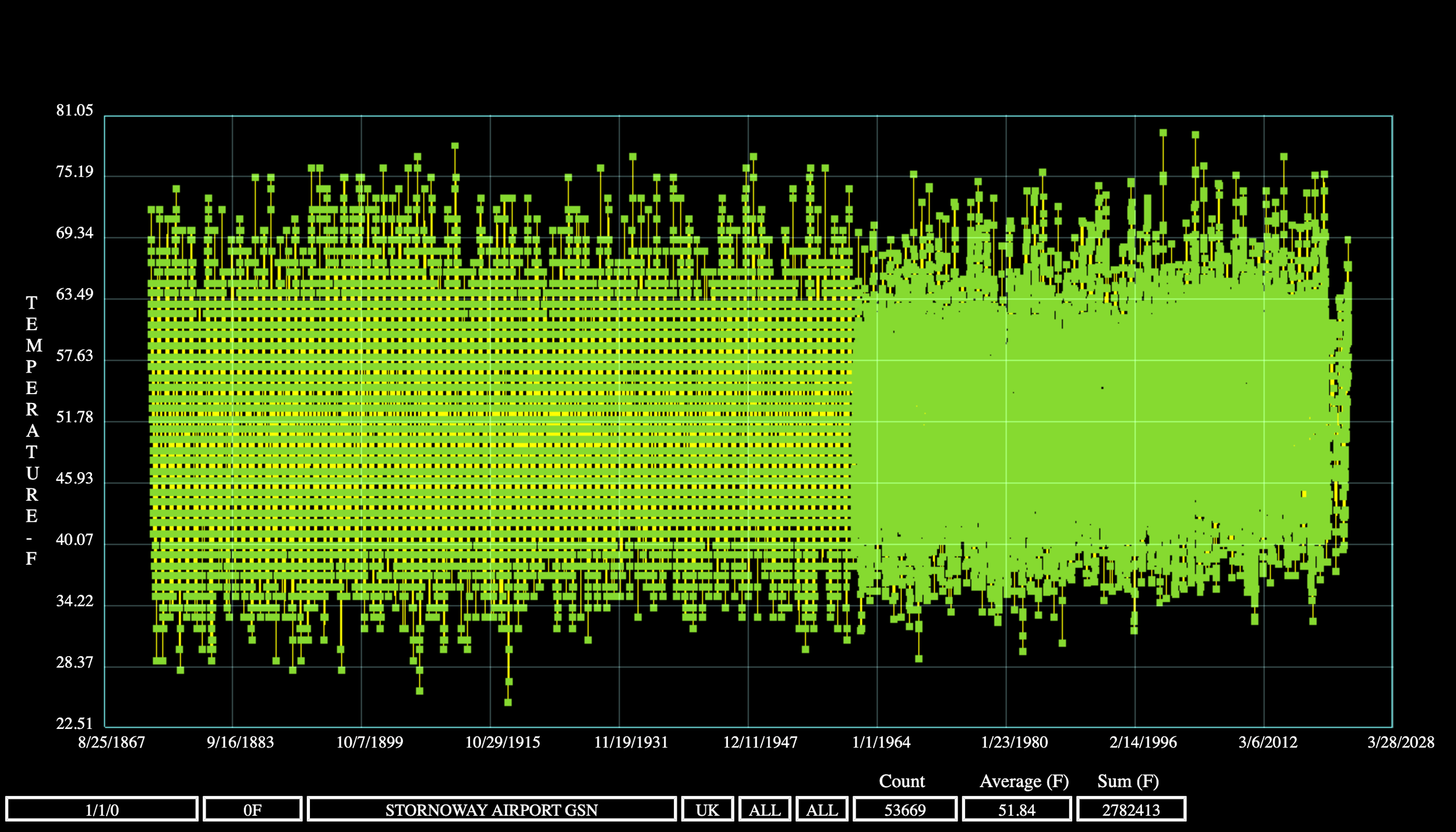
United Kingdom
I’ll start with Armagh, because it’s so nice to see continuous thermometer data from 1844:


I’ve pointed out before that Oxford seems to have an upward slope that others don’t. The thermometer is at the Radcliffe station site, which is now in the middle of campus. And remember that local pressure systems can cause deviations from the regional norm …

Germany


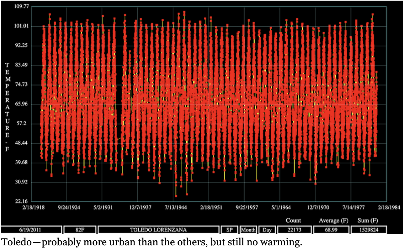
Spain


Iceland
At the Stykkisholmur remote site they have been collecting climate data since 1800, but this normalized graph only shows since 1948. Again, we see not much trend in summer temperatures but a gradual and slight uptrend in winter temperatures.

For comparison using the same axes, here is their data since 1946 — not much rise since then, really.
And here’s the airport since 1946, which tells the same story. They either had one very hot day or one thermometer mishap in the mid-1970s …

Summary
I thought we were supposed to see a trend of increasing temperatures worldwide. We can clearly see winter temperatures rising a bit, but that isn’t explained by CO2. It’s explained by the arctic amplification happening now. In 20 years, it will go back down, as it always does.
Am I cherrypicking? I’ll let you decide. Explore more such station records at RealClimateTools.com and look at the remote vs the urban thermometers.